
Asurion In-store Claim Experience
Asurion - In-Store Claim Experience Web App
Problem
The repair time for a product was extending 12+ days. Users were out with their tech, frustrated and thus reflecting on low NPS scores. We were losing users and their trust.
In addition, the company rebranded and this was our opportunity to transform the claim experience.
💡 What I learned
Design lead on an enterprise rebranding design effort
Strategizing a North Star Design solution to MVP
Identifying multiple potential future design opportunities for multiple flows

Repair your tech locally.
This effort was to design a 5-star claim experience, reduce repair time and build trust equity. I led the research, design, and delivery to provide users this new repair option on the digital claim flow.
Goals & Metrics
Transform the claims experience to the new branding
Humanize the content to create a trustworthy and friendly experience
Increase take-rate by ~10% on in-store repair experiences
Reduce repair time from 12+ days to 7 days
My role
Lead designer — discovery, user research, design, testing
Team
Derek Tam, Design Manager
Emily Springer, UX Designer
Lauren Everingham, Product Manager
Daniel Mangistu, Development Lead
Marcus Quarles, Development
Selling the work
The rebranding positioned the project to redesign a claim experience. After vetting the north star design, I was given the 👍 to lead the redesign in addition to creating a solution for the repair claim experience.
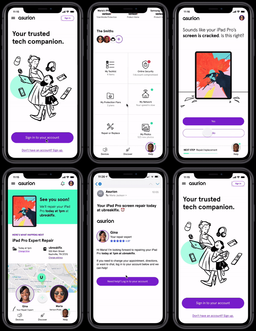
North Star claim experience
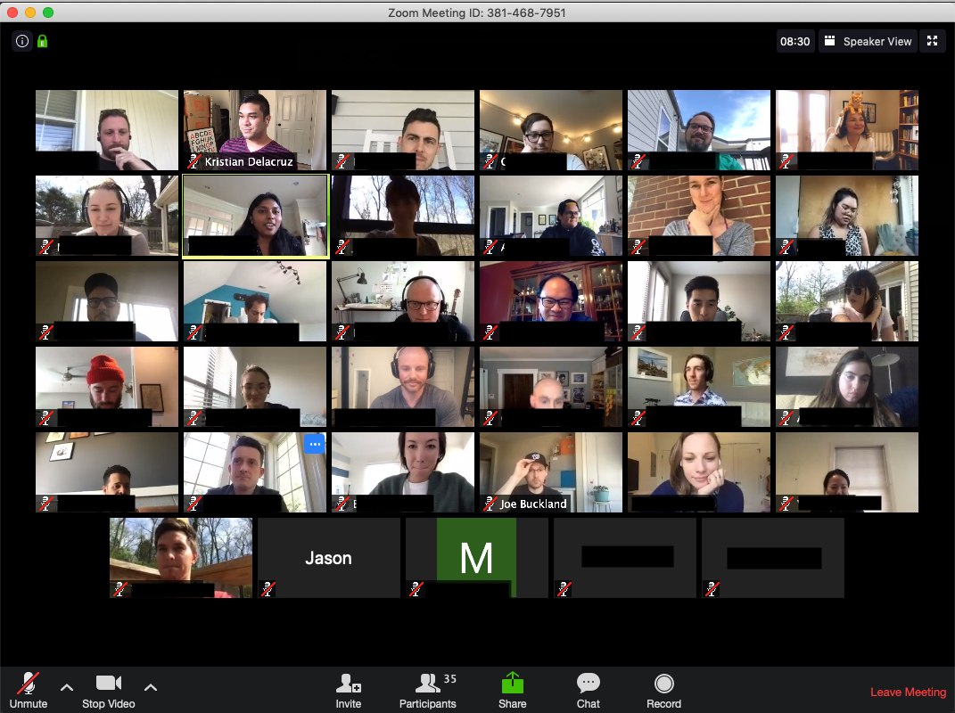
Hi there, COVID-19
The world turned upside down when the 2020 pandemic hit the world. The team identified key principles we wanted to keep that helped me moved forward with the project:
Our health was a priority. Take care of yourself.
Communicate with intention.
Psychological safety-nets were established to do great work.
reflection
These moments energized me on the project and it also let me know that our customers were going through the same experiences as we were.
Ambiguity to the max
With a path in place my emotional state was ‘all over the place’. With my customer-obsessed mindset, I went straight to what I know best — empathy.

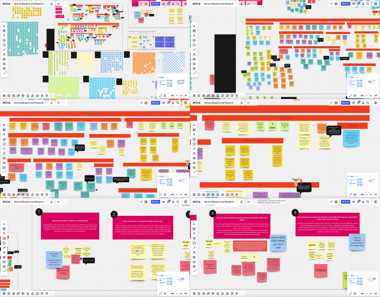
Reel us back to reality
Research and synthesis
1.5-month extensive research was conducted to learn more about how our customers were feeling, thinking, and behaving. Tests we ran:
Usability testing
Highlighter tests for content
Competitive analysis
Market research surveys
Listening sessions
The team synthesized all the data to create experience principles that grounded the team with multi-facet insights and empathy.
“I prefer to know the repair timeframe and if it can be fixed on the same day. As long as you set the proper expectations I’m fine with it. Honesty is the key. I always want to get notified by text/phone option.”
Experience Principles to guide us
With cross-intersection research that was conducted the team moved forward with Experience Principles as the outcome. These principles encapsulated reoccurring themes that connected with other studies across the enterprise.

1. Help me know what to expect so I feel prepared
Help people understand what is happening when, and why to build trust. Be transparent about what's around the corner whenever possible.

2. Show me options so I can pick the right value for me
When starting a claim, customers want to feel there is clear value in a repair or replacement of their device in their situation. Acknowledge the cost-benefit analysis most customers do in their mind when debating the right path and offer clear breakdown (matrix) of cost of item.

3. Show me you're listening and personalize the experience (Do it right!)
Show through visuals, messaging, and features that you know me (my name, my past, my preferences) and are considering my needs. Minimize asking for information we should already have and meet customers where they are.

4. Let me decide how critical my situation is and allow me to pay for a prioritized / faster experience if I choose
Consider the customer's need, product-specific "criticalness" and the individual context and provide opportunities for them to choose upgraded/expedited options, including options to pay for that upgrade. Always aim to meet or even exceeds the customers’ expectations for repair time.
Service Blueprint as our business strategy guide
Another artifact we tied with our research effort was an end-to-end service blueprint. I strung multiple experiences together that were connected with the experience principles, quotes from our users, and also alignment on the back of the house with our Product Managers.
Findings and next steps
Integration with the “Hub” platform was not viable and we need to work separately for this effort.
Definition of long-term business strategy on fulfillment opportunities was still in flux. Focusing on creating a 5-Star experience was most important.
💡 What I learned
Business and product strategy is always in flux. Utilize visuals and research to guide your stakeholders.

Honing on the tangled spaghetti
Now equipped with our experience principles and service blueprints we laid out the land of the claim experiences from a flow standpoint and worked closely with my Product Manager to prioritize and target areas of the experience that needed attention from a UX standpoint.
Peril (product problem) - 7% drop-off rate
This page was causing some pain points from a logistical standpoint and customers were not providing a detailed description of the product problem causing increased drop-off rates. By optimizing this experience we can reduce friction on all fronts.
The current state. Where we were going.
When this effort started the team was already developing a “band-aid” redesign of the experience causing confusion on priorities the business need of the change.
As part of the auditing process, this was our leverage to ideate and fully evolve the claim flow to 100% initiation of the rebranding— rather than doing color and button changes.
Design Opportunities
As I gathered all the transactional flows and designs — numerous inconsistencies bubbled up on a component and content level. There were plenty of design opportunities that I could tackle and after prioritizing the work we focused on four key opportunity areas to elevate the designs even more.
💡 What was surprising
It was challenging on stepping outside the box of the current designs. You have to balance viability, accessibility, backend data, and a timeline.
Exploration and iterations
I explored the different iterations on how a customer would input the fault of their product and confirmation of their personal information.
This problem was a content and human behavior challenge and we wanted to empower our customers to input detailed information so that our technicians can fix the problem the first time.

Claim eligibility. A challenging problem
In parallel, I was working closely on reimagining the Good News page. This page is the halfway point on the claim and also displays if the customer is eligible to move the claim forward. This page was the connective tissue for making the customer whole with their product
Questions we wanted to debunk
What are the criteria that make a customer’s claim eligible?
What is the percentage of customers are dropping off?
Why is the product catalog still being maintained manually by spreadsheets?
Do we need this page?


Opportunities for eligibility
In this process, the design process help expose opportunities to help the enterprise. There are gaps in the enterprise that is causing friction to the customer. We provided these opportunities to leadership to give them insight and push on adding it to the roadmap.

Purchase Product Catalogs
How might we utilize a third-party API or third service that captures all product SKUs for better maintaining the these product assets?

Conversational AI Model
How might we build a AI model to capture the product problem up funnel to determine eligiblity earlier in the claim experience?
Pivot and reprioritization
After several conversations with Product leadership, the team had to quickly pivot to focus on the second part of the claim flow. This gave an opportunity to go deeper into the problem and focus on the key metrics we had in place.
Our priorities
Focus on in-store claim experience
Be iterative and test designs often for 3-month launch
Be thoughtful of mental models for in-store repairs because of COVID
Work closely with development to launch the first enterprise rebranded claim experience

Let’s choose a store
After the pivot, requirements changed and new constraints were uncovered. The core page we wanted to bring forward was the screen where customers choose the store they want to go to to get their product repaired.
Mid-way through I learned that the North Star design would be stripped from some of its features and had some key findings through usability testing.
Technical constraints
Tech Expert image wasn’t connected on the store level
Scheduling is handled differently because each store is a franchise
Geo-location of each store will be a dependency and need to be addressed
The progress bar would become a scope creep
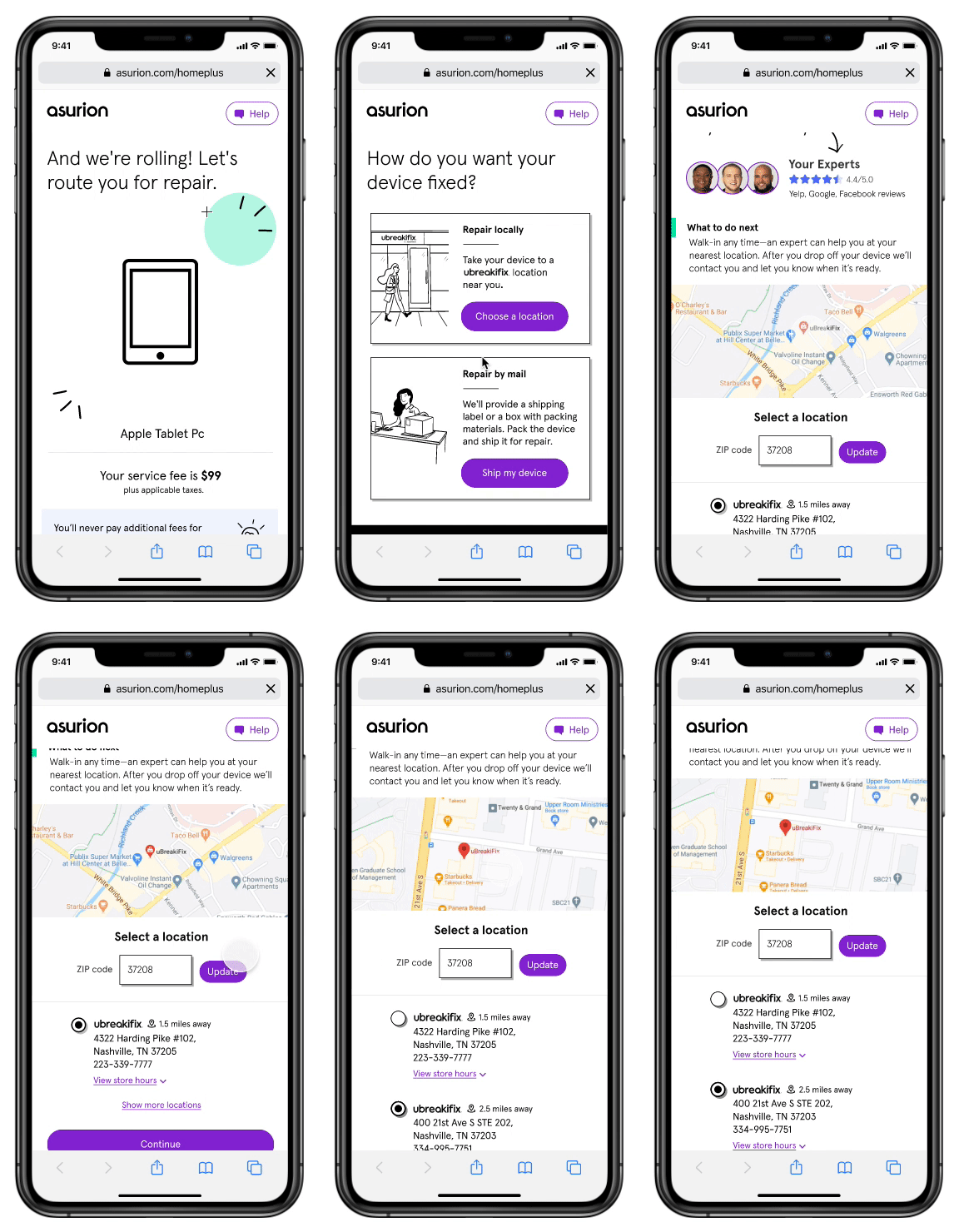
I had to make two distinct designs for this page for MVP and Final versions, based on constraints, phasing, and user feedback from testing.

Usability test key findings
Customers thoughts
Repeating themes bubbled up from 4 usability tests through different iterations of the designs.
Key finding #1: Customers feels like the store is trustworthy with the expert’s image
Customers felt having the expert’s name and image was really important for them to build trust and transparency. They know who will be fixing their product.Key finding #2: Star-ratings create skepticism
Customers felt the star-ratings might not reflect the actual expert. Is this the store’s ratings or the specific experts? This was confusing and it was a string that might lose the customer’s trust.Key finding #3: Scheduling options is a must
Depending on the customer’s availability scheduling a specific time will help manage time and expectations. Customers expect to be taken care of at that time rather than an estimated time.
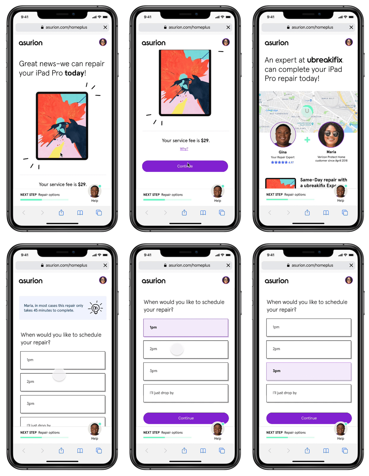
North Star Design - v1
Final Developed Designs
Transformation-extravaganza!
After validating and testing our designs we moved to making additional iterations and working closely with developers to deliver the experience.
With a small team, I had to create a Basecamp account and provide high-fidelity designs for our developer to pull from. This kept the communication stream consistent and centralized. There were times in the process I had to quickly ideate and iterate on a problem— and by bringing everyone in a quick Zoom meeting to sketch and brainstorm with the team resulted in a quick resolution.
💡 What was challenging
The development team I was collaborating with was not integrated with the Design System that other teams are plugged in on. I had to re-sync with my team weekly and remind them to begin integration— but the development teams rationale was the fear that it would cause more tech debt resulting across all the retail products. Long term I knew this would lessen tech debt when they are integrated

Outcomes
~12% take rate on in-store repairs on the digital channel in the span of 2 months
4% decrease of drop-offs on the Service fee page
Increase of in-store repairs for laptops
Create consistent email communications for customers to remove disjointed hand-offs
The designs influenced many other transformation efforts within the enterprise
The results are in and we are getting a take rate of…
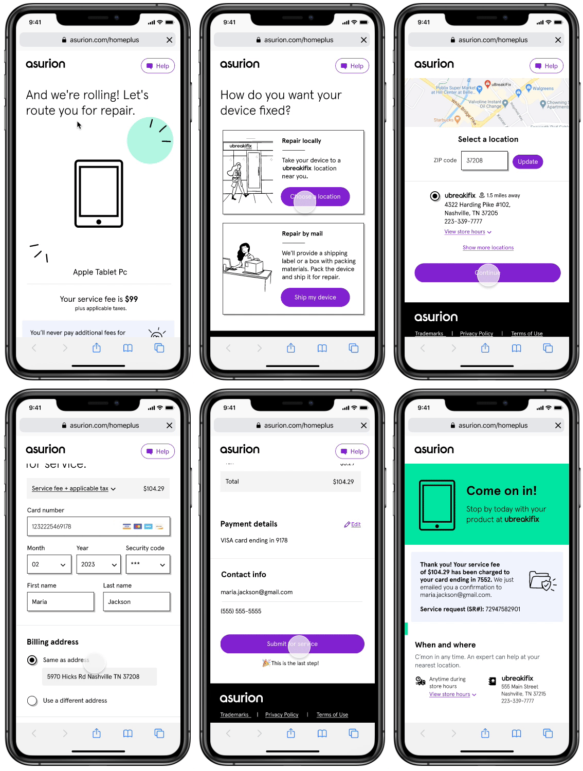
Final Prototype
Reflection and self-transformation
This was an exciting and challenging project for me. It made me think about the end-to-end experience while involving rigorous research to back up iterations of the designs to the team. However, shifting priorities mid-way through the project made it difficult for some features and interactions to be implemented. Still, I learned some important takeaways from this project related to product and business processes.
Adapting to changing requirements and priorities
With many timelines, rebranding ambiguity, and reprioritization mean the scope of the project was constantly evolving. I needed to adapt to those changes and still deliver the best experience in time.
Always fight and push for the best UX
With strict technical constraints, I had to push the voice of the users forward by using our experience principles and findings from our usability testing.
Prioritize what we can’t do
There were cases we were exploring opportunities to make a great user experience — however, every single one would be a scope creep for the team. I had to determine where the real value was for the customer so we were putting their needs first.

