
Azure Active Directory - Cloud Sync Health
When you are syncing user data from on-premise to the cloud you need to monitor all the information that comes through.
Cloud Sync Health allows enterprise admins to view, monitor, and evaluate the provisioning of users from on-premise servers to the cloud. This will enable admins to quickly go through data and evaluate errors for better troubleshooting.
Users - Enterprise IT Admins
My role - Lead UX Designer. Research, Visual Design, testing, and delivery.
Team size - Program Manager, Engineer team
Customer blockers
With multiple customers interviews and calls, there was a need to be aware of sync health data (errors, provisioning status, agent) during a provisioning sync. Customers expressed their thoughts and I synthesized them into three insights:
Give Admins transparency on the data
Allow users to know what errors are going through a sync and show me the amount of information coming through to the cloud.Recommend me troubleshooting insights
Provide users recommendations that can help resolve an error.Give me awareness on complete time
Give awareness to users on how long a sync will take for better visibility and task management.

Current experience pains
No option for visibility and errors
• Customers are not able to view errors
• Data is not connected during Cloud syncs
• Managing agents are still a needDifficult to navigate
• Pivoting through different screens wasn’t designed with users in mind
• Awareness and notification not implemented for errors
The goal — provide accurate errors data to our users for better troubleshooting.
Impact
Reduce time for Admins to way find through different logs within Azure Active Directory and go through a reliable source for data going to the cloud.
The challenge

Parity with Cloud Sync vs standalone
How might we have cloud health feature be incorporated with another feature or on its own feature?
Connecting past concepts to current patterns
How might we get inspiration from past concepts and converting them to our design patterns?


Deprioritized feature
How might we utilize design thinking to influence the priority of the feature?
Research and alignment
Competitive analysis
The team leveraged learnings from AWS sync features and other Azure features that involved data sync and error management.
Further research of provisioning data
I did extensive research on how users sync from on-premise (server) to the cloud. Cloud Sync is a feature that enables companies to do this over time.
Design system and other features
While ideating and sketching ideas I had to utilize our patterns and leverage other features patterns to visualize different data pivots.
Feature architecture

Before we ideated on solutions I gathered the team to propose where Health will live. After several sessions and requirements gathering the best solution was to incorporate it on Cloud Sync’s main page. The team thinks that this will help with Microsoft’s customers’ hybrid cloud journey. Other factors were also mentioned:
Cloud Sync redesign is in development and this will be a good opportunity to incorporate the new feature
Connect sync (on-premise feature) will not be supported in the coming quarters
Exploration and iterations
Initially, I had to determine where this feature would live. I conceptualized the interaction from the main page of Azure to Cloud Sync. This task flow helped the team understand where Health will live.
I then focused on the Sync error page and proposed some ideas for my Program Manager. Some design decisions I wanted to put forward:
Empower IT Admins with initial numbers upfront— rather than digging into lists
Iterate on different layouts and visualizations that would provide a top-level filter.
Provide information for IT Admins so they can troubleshoot failures and errors.

Sketching through Sync errors
Throughout the process, I worked closely with my Program Manager to conceptualize and sync the requirements to the Azure portal. Along the way, I learned that it was difficult to understand the sync process and that there are different moments of the syncing progress that will affect the data. I explored numerous options that would put the errors upfront and enable Admins to troubleshoot the errors.

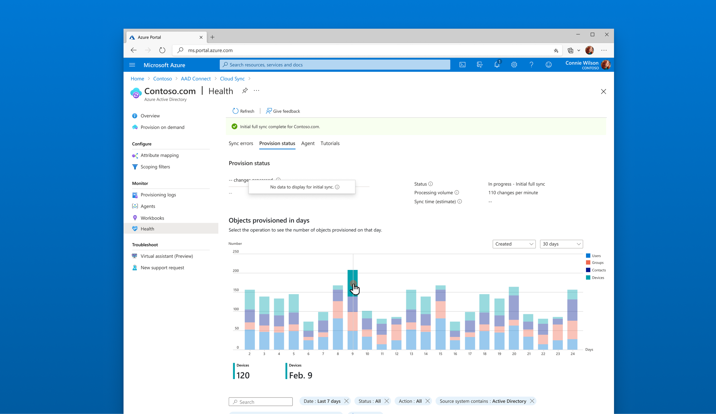
Provision status designs
Another part of the data that admins wanted to be aware of is the health of users going from on-premise to the cloud. This was an opportunity to showcase a large amount of data using different data visualization patterns while leveraging simple interactions for our users.
Graph interactions
I wanted to provide an accessible way to look through the data. As the sync continues to go through the data the Admin is able to sift through different parts of the data to help evaluate if the sync is going smoothly.

🤔 Assumptions to its limit
During ideation, I had to battle imposter syndrome to make sure my designs were meeting requirements. My Program Manager was providing me with little information to be confident in the designs. Thankfully, we planned to validate our concepts with feedback from IT Admins that is using our services.

Feedback and learnings

I took our designs to an advisor session to gather feedback. These sessions are an opportunity to bring concepts and further understand what users want and also find potential small usability issues. Here are a couple of key findings:
87% of participants preferred sync error data to help troubleshoot provisioning errors
60% of participants would rather utilize a list view of the top errors rather than the card pattern
40% preferred to see errors on the cards
61% mentioned provision status is moderately important
76% of participants want to know if the sync is running as expected.
Key insight
Users want to know in time what is going on with their sync. They don’t need to know when it’s finished users are wanting to know if everything is going to plan. Having errors upfront helps remedy the situation quicker — rather than searching around the Azure portal.

Next steps
This project is still in flight and we are working on another part of the health. My program manager and I are continuously improving the designs and we will go through another round of advisor calls and usability testing. We found out that Cloud Sync is well known than we thought. Still, I learned a lot in this project. As one of my first projects at Microsoft this helped me understand the ecosystem and processes I need to take to influence design.
Adapting and learning quick
Being in the Cloud platform was a challenge at first. But after working with my Program Manager and talking in stories that helped me understand the feature at a bigger system.
Choose what we won’t do
As we went through the requirements some of the features did not align for our MVP. Also, some of the thinking wasn’t relevant after alignments from our customers. Choosing something minimal is better for our first phase—then we will continue to iterate.
Fight for an understandable UX
Data visualization for Admins can be straining and overwhelming. Keeping it simple and clean is a good approach for health data visualization. Although Admins prefer lists for data scanning the less the cognitive load the better.