Amazon Coverage Experience Redesign
Amazon Protection Experience Refresh
Problem
Amazon wants to have an exclusive partner to drive customer satisfaction at every touchpoint on purchasing a protection plan. Amazon wants their customers to never be left in the dark about coverage (no ‘gotchas’), never waste time figuring out how to file a claim, and never have to worry if something goes wrong with their purchase.

1 Day Design Sprint Chaos
The challenge
What is the design going to do?
My role was to influence and collaborate with a third-party marketing agency to iteratively produce a human-centered product. The team comprised of Senior Directors and Senior Managers, which was intimidating — but I was ready to tackle it and bring empathy into the mix.
Users affected: ~90 million Amazon customers
50million – 75million company revenue driver and continuous partnership with Amazon for innovation.
~65% increase of customers filing a claim on Asurion’s claim portal.
30-day user research and design efforts.
(Numbers are changed for protection purposes)
Kristian’s emotional level: 😱
Let’s do user research, but…
One week after kick-off I was informed that a third-party Agency had surveyed 300 participants. This was information that made a pivot on my role but provided insights that helped the team with foundational data.
Key Insights
Top three features participants want to know:
Description of the plan
Plan term length
Participants are most interested on three benefits:
Easy claim filing
No deductibles or additional fees
24/7 tech support
56.45% of participants said that they would be more likely to shop on Amazon if they offered a single protection plan that covered all of their devices
Designing for everyone and Lilly the E-Retailer Loyalist
With a huge customer base, I recommended thinking inclusively with Amazon’s customers. To move beyond existing biases, I educated and experimented with the team to designing for everyone, everywhere. I created Lilly for the team to focus on a human while we conceptualized problems.
Inclusive design reframing
Linear path to services
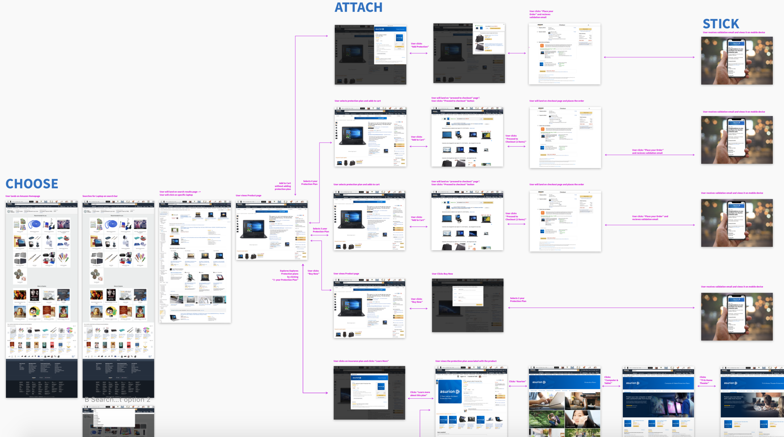
The goal of creating a map was to help visualize the linear path the current experience customers are going through. This map opened up conversations on how we can think to open up other technologies to help Amazon customers to understand their plan and to file a claim easily. We utilized research data conducted from the customer experience team to help back up ideas:
Customers are not receiving their validation email
Customers don’t understand the entire protection plan
Customers are not consistently refreshed about their plan

Let’s talk to Amazon customers
I recommended doing qualitative research from customers. The reasoning for this recommendation was to help the team understand customers through video, stories, behavioral and motivational data. I prototyped the current flow from purchasing a product, attaching a protection plan, reframing the customer having an accident, and going through the claim flow.
Instead of testing for the right answer, I wanted the research to set a foundation for the team to work on to think of solutions that can help customers understand their protection plan.


Not your ordinary customers
I collaborated with the customer experience (CX) and market research team to conduct 10 usability testing sessions for 1 hour per session. Our goals were to understand customer behaviors, but also discover challenges the team could improve.
Insights
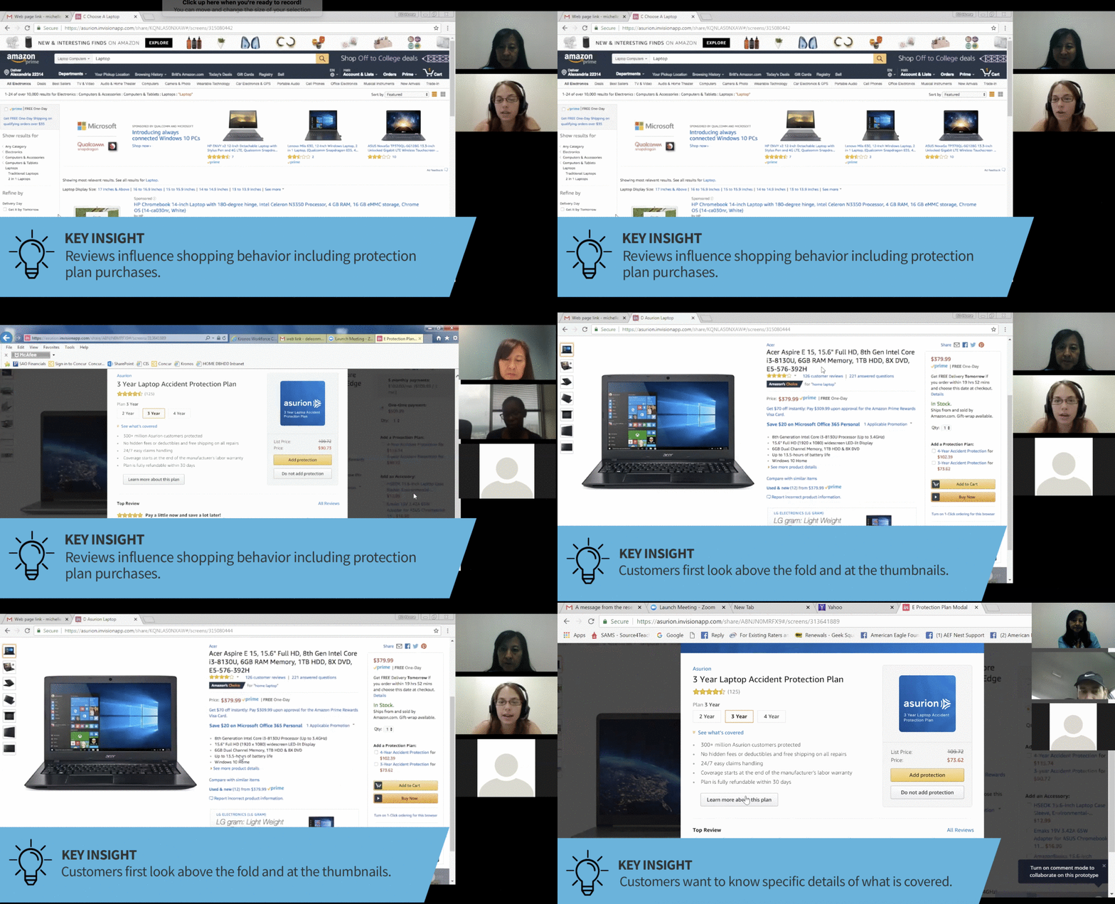
Reviews influence shopping behavior.
Customers looks through the product thumbnails to evaluate their purchase.
Customers wants to know specific details of the coverage plan.
Customers expect information to be populated on the claim experience.
“I would read the reviews on the protection plan. So it’s telling the truth.”
Sprinting towards an 11-star experience!
I recommended conducting a 1-day design sprint we called an 11-Star. We used all the findings from the test and leveraged the data to ideate on creating an ‘11-star experience’. The team attempted to solve problems holistically through multiple channels and platforms to provide a ‘no gotcha’ experience for Amazon customers.
The workshop brought in 10 team members from cross-functional aspects of the business to provide diverse perspectives. The goal of the workshop is to give a deeper focus on coverage and customer experience through different channels.

Revealing the data
The team started by looking through analytics that Britt Becker (Product Management) gathered.
21% of customers are not receiving confirmation emails.
15% of customers are not receiving shipping label emails.

What is that experience?
After we were exposed to the data. We split into groups to ideate into different touchpoints of the customer experience.

Teamwork makes the dream work
The workshop was a success! It helped the team focus on key parts that was needed for Amazon. The workshop also provided an outlook on what key features the team needed to help drive low costs and execute a better customer experience.
Takeaways from the workshop
Create a cadence for the team to meet every other week on updated work
Collaborate with third-party marketing agency to create visual assets to better understand the protection plan
Redesign validation email to be simple and visually easy to read
Reducing reading time of Terms and Conditions by 25%
Design and iterate on a FAQ page
Sketches of an updated simple, clean email design
Did I get my email?
21% of customers don’t receive their validation email. This was a task for me to simplify the design and curate content that is important for the customer. The goal of the redesign is to reduce the percentage and let customers be aware that their purchase was valid and that their product is protected.
Marketing vs UX
One of the challenges I had to face was collaborating with a third-party agency. With their work mainly on the marketing efforts, I was challenged to implement some of the design patterns to the email. This caused blockers on accessibility and branding.


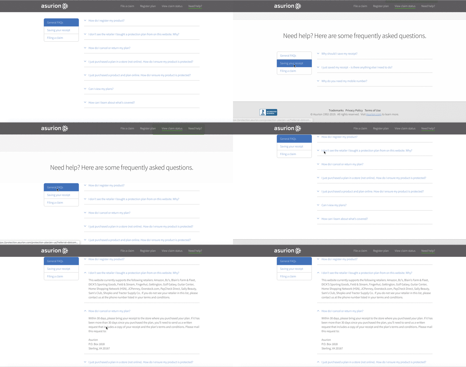
Current FAQ design and content
The FAQ isn’t doing its purpose
While evaluating the information architecture of our portal website. We are not allowing our customers to fully understand their coverage and hiding it at the bottom of the website— we are then guiding them to the Terms & Conditions which is a document not for the feint of heart.
Our goals was to expand our coverage information so that customers are able to digest and understand them while they are filing a claim or searching for Asurion.
FAQ content repetition
I created a content model to help the team visualize the content we are currently show the customer. There was a quick discussion that “Save a Receipt” was a repeated and that it should only be told once. This visualization helped convince that an updated FAQ page about Asurion’s protection plan was an important feature.
Giving customers what they need
While collaborating with Britt Becker (CX and Product) we looked through the Terms & Conditions, wireframed and conceptualized the top categories we want to present to the customers. From some research, competitive analysis and analytics from claims the top topics we wanted to focus on:
What’s covered?
When does my coverage start?
Do I need to register?
Manufacturer’s warranty
Additional FAQs


What’s my coverage?
During this time the Asurion Design Group was going through iterations of a design system. I had a chance to utilize some of the patterns and stayed on our conventions. The goals of the FAQ page was to provide the customer a birds eye view on what their coverage is providing and allowing them to have confidence on their purchase.


Asurion won the contract 🎉
The results
Acknowledgement that the Design efforts was a determining factor of the win. We were “Customer Obsessed”
Asurion will be the exclusive partner for ~1000+ SKUs for Amazons products (i.e., laptops, head phones, and more).
Build closer relationship with Amazon to scale different services.
Average of 4.5 Star ratings for the service and continuously growing trust for Amazon customers
~5% Increase subscription base for Asurion Home+ members
