Asurion - Shipping Claim Experience Web App
PROBLEM
Through research and data, customers need a faster way to ship their broken products to Asurion’s repair center. Users are comparing our service to other companies — currently, Asurion is sending shipping labels or boxes that take 5-6 days.
💡 What I learned
Managing design process on a tight deadline
Collaborating with a content strategist for consistent enterprise content
Creating designs for multiple cross-platform and client-specific experiences and branding

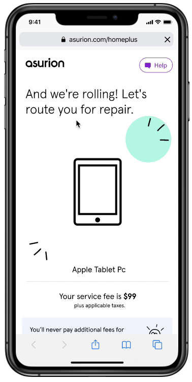
Asurion’s shipping claim experience is a repair flow that gives users options on what is most convenient for them.
Challenges
The current web requires a redesign to make it consistent and trustworthy.
The QR code is initiated after claim submission from UPS.
The shipping options are determined by the customers’ location.
Goals & Metrics
Transform and humanize the claims experience to the new branding.
10% take-rate for the QR code option.
Reduce product shipment time to the repair center from 6 days to 3 days.
My role
Lead designer and collaboration with content strategy— discovery, design, interaction design, content strategy, testing
Team
Derek Tam, Design Manager
Emily Springer, UX Designer
Lauren Everingham, Product Manager
Daniel Mangistu, Development Lead
Mary Speidal, Product Manager - Communications
Crystal Thomas, Product Manager - Communications
Timeline - 1.5 month
We committed a deadline with UPS which resulted in a quick turnaround. From a design standpoint, I knew this would result in quality issues. However, I wanted to bring in user research to validate and learn if our customers needed this feature.

Research insights
With collaboration with market research, we gathered quantitative and qualitative data that was correlated to the effort. We used this data to guide the team on the potential pit-falls we might face while we were in the solution phase.
Key insights
Misinformation or lack of information
There is misunderstanding of the coverage elements (eligibility, service fees, shipping methods, etc).
Lack of timely communication
Not receiving updates regarding the status of the claim or the repair is lacking precence.
Lengthy wait times
Filing a claim, timing to get back a working device was longer then expected.
Repair expectations not met
Repair not completed properly the 1st or 2nd time.
“So I didn’t hear anything after sending in my laptop so I called a couple of weeks later …they said they had to order parts. I needed to get parts 3 times. When I got it (laptop) back, I had problems with it. I had to get another laptop…didn’t want to file another claim ”
Birdseye view of the flows
With an enterprise branding transformation full effect, I needed to realign with my Product Manager and Development team to make sure we were setting the right expectations in a flow perspective. This resulted in several findings:
UPS initiated QR code is not triggered instantly
Clear, simple content will be a core component of the UX
COVID-19 messaging is crucial to protect our customers
Rebranded experiences for consistency is a focus

User flow and back-end decision points document
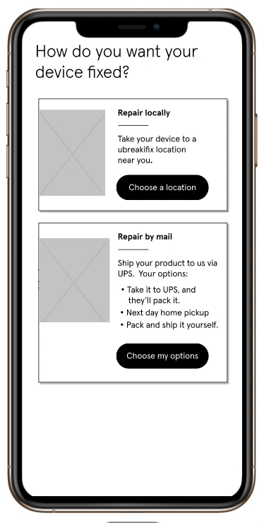
New shipping options
Knowing that customers want more options. I explored and sketched different options on how to expose the content. With different layers of complexity and safety, we wanted to condense content without sacrificing context. What we discovered:
UPS drivers have COVID processes that we want to expose to the customers
Product partners didn’t want to add COVID safety content. I pushed back for ethical ramification concerns
Provocation on eliminating printed paperwork
💡 What I learned
This one page needs to be repurposed on all platforms
Content consistency end-to-end is difficult to maintain


Wireframes, sharing, and testing
I wanted to test quickly and iteratively on this flow to learn from our stakeholders but also collaborate with my fellow content designer to draft our first round on the content.
Instead of designing for the right answer, I designed a flexible experience to be optimized across all platforms efficiently and in a simple manner.
Working with the lowest fidelity
Iterate quickly on content — UI, e-mail, frontline agent scripting, and printed materials
Stakeholder visibility through weekly meetings
Conduct A/B testing and gather data
Focusing on the option page
Wireframe exploration of the option screens
A 🔄 B test findings
I ran 2 A/B unmoderated tests to quickly engage on customers’ feedback on the wireframes.
Key finding #1: A lot of content is increasing cognitive load
Participants mentioned that Test B was cluttered and overwhelming with all of the content exposed.Key finding #2: Icons are helpful but not needed
All participants found the “what you need” section helpful. It prepared them ahead of time on expectations and provided a sense of transparency.Key finding #3: Previous shipping experiences is reflected heavily (I.e., Amazon or UPS)
All participants mentioned either Amazon or UPS during the tests. They found that this experience was similar and simple to the other companies.

Test A - Snack Bite
Test B - Give it all
Deep dive on the content
A critical part of this experience was setting expectations upfront for the customer. I worked closely with Emily Springer a Content Designer and Product Manager to hone on transparent and humanized content. While we were iterating on the content had some principles to keep in mind:
Set clear transparent expectations
Evolving the voice and tone of the rebranding
Document and reuse similar content structures across the enterprise communication UX
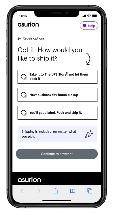
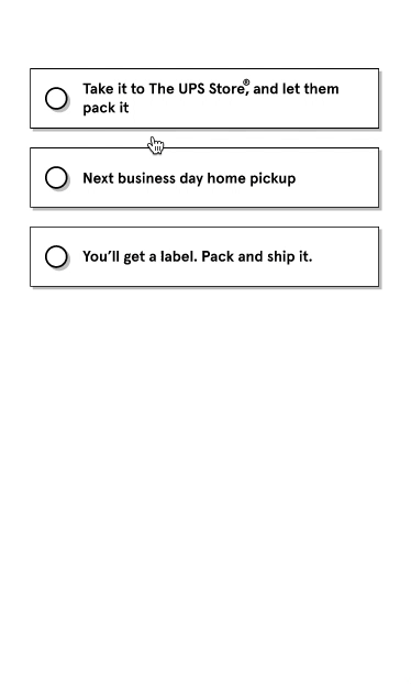
Choose your option
This page provided context and options for the customer to choose what was the best option for them. This was a careful balance of providing enough without overloading the customer with too much detail of the process.
We also conducted 2 usability tests to further validate the content and learn more from the customers.
Usability testing findings
Key finding #1: Extra content was helpful but needed
Participants found the content to be easy to understand. Some participants knew the next steps on the QR code option.
Key finding #2: Customers don’t have printers
Participants saw that they need to complete a repair form and expressed that they don’t have a printer and causing friction on the experience.
Thinking the interaction
I chose this interaction because of the density of the content. This provides a visual focus when a customer chooses. Overtime this design will flex and scale depending on where the business will go and it utilizes a framework that is scalable.
This simple interaction provides flexibility on the development team for future features and offerings.
💡 Experimentation and monitoring
We worked with development and analytics to make sure this page captures customers decisions and drop-offs
We were also monitoring if customers were adding the printed material with their products
Figma prototype testing possible animations
New challenge
Consistent content at scale…


Information architecture + components analysis
As we were finalizing the designs our Content Strategist ran through challenges in maintaining content on an enterprise level.
I took the first stab at how to solve this problem and analyzed the current architecture at a component level.
What I learned
80% of the content components are transferable to all platforms.
Client-specific experiences/content are in flight and difficult to track
Continuous experimentation
After evaluating the content we explored breaking parts of the UI into different blocks that would comprise the entire screen. This would be easier to maintain and also design in a modular mindset.
After thinking about these blocks our Content Strategist can easily identify what needs to be added to other communication touchpoints in the enterprise.

Laying out current content blocks

Identifying and naming patterns and dynamic variables
Team space for feedback
Figma was a helpful tool to have the Development team be part of the process. We’ve provided wireframe concepts to the development team on week 2 and they started to code the bare minimum of the designs. This gave them an opportunity to ask questions and feedback via Slack or email.
On week 3, we were 75% complete with the experience — as the developers continued to observe and be part of the process their confidence level was energized by the tight deadline.
💡 WHAT I LEARNED
Our development team are human. Get to know them as people to build trust
Be quick to iterate and don’t be afraid to fail and learn. Progress over perfection

Collaboration session with development team
Results and next iteration
~16% take rate on QR code option after 1 month after release
Laptop repairs reduced by 3 days with QR code
Tablet repairs reduced by 2 days with QR code
22% reduction on call center calls.