
Amazon Photos - Shared Photos 📸
Business Impact
Displaying photos on a Echo Show is the top-3 reasons why customers purchase an Amazon device. ~30% of Echo Shows are displaying personal photos on the home screen. In 2024, 5.1 million customers has the ‘Photo Frame’ feature enabled on their Echo Show. Lastly, customers with Fire TVs also saw an increase of photos displayed on a larger screen.
Problem
Echo Show Device sales were flatline on 2022 Q3 and Q4. Amazon Photos personalization rates remained steady for the past year after the release of ‘Photo Frame’ on Echo Show Devices.
Senior Leadership wants the new Echo Show to boost sales and usage by using Amazon Photos sharing features to attract more customers without Echo Shows.

The challenge
Shared Photos for everyone
The goal was to have Amazon customers share photos with others in a simple and delightful experience by device or mobile app. This resulted designing end-to-end from out of the box experience, first time UX, engagement strategies, and increasing awareness on device personalization.
High-level goals:
Increase personalization rates of Echo Shows through a “shared photos” experience
Create a simple and delightful experience for deeper engagement
Increase Echo Show purchases


My role
Day 1 ownership
Lead UX Designer (Device Personalization, Out of the Box Experience) - discovery, user research, design, testing, and execution.
The team consisted of:
User Researcher
Content Designer
Motion Designer
3 UX Designers
3 Product Managers
4 Engineer teams.
The project successfully launched September 2023.
Amazon Photos Groups Redesign
Introducing Shared Photo Frame
More people are regularly taking photos on their phones. Amazon Photos aims to make it easy for customers to show photos on their Echo Shows and let others in a group view them together.

Designs collaboration with Savannah Schuchardt: first-time user experience, device personalization and Echo Show photo display
Touchpoint 1 - Device Setup
Echo Show Onboarding
We proposed for news customers to add photos on their device during setup, by using the Amazon Photos App. On the current experience customers had to download the Amazon Photos mobile app after setup.

Touchpoint 2 - Mobile app onboarding
Invite others in the group
To increase engagement, the refreshed first time user experience allows customers to invite others in the group. The hypothesis is that if customers invite others in a group this increases usage on the mobile app and entices customers back to use the Echo Show.
Design concepts by Savannah Schuchardt. Animation study by Atichart Pinrut.
Touchpoint 3 - Control your device
Display photos with the app
Displaying photos on devices was difficult for customers. I wanted to simplify the experience and use patterns that are familiar.
4% of customers were utilizing the device personalization page on the mobile app and we wanted to target 10% usage on this new experience.

Design concepts that I led and proposed to leadership
Research Insights
Photos on Echo Show is frustrating

Setup paralysis
Customers are going through a 15+ steps out of the box experience for Echo Shows. Amazon is showing our organizations.

Disruptive App download
New Amazon Photos customers are prompted to download the app to display photos on the device.

No Photos app on Echo Show
Customers were frustrated that there wasn’t a navigation point on the Echo Show.

What photo rotates?
Some customers are hesitant to display photos because they don’t have control on it rotates on the screen.
“You need to be real careful about which pictures pop up on that screen. My mom would have a heart attack. I was scared what was gonna show up on there so I need to see which pictures it's going to choose." - Participant A
Reframing the customer journey
Photos features skipped during setup
From anecdotes, customers are voicing that setting up a Amazon device is long (10+ steps). Personalizing your device with personal photos is in the middle of the experience and some customers are skipping the step. I challenged the team how we can have customers add photos to their device in a simple way and avoid having customers download the Amazon Photos app after setup.

How we got here
Setting up the backdrop
Several questions informed my design strategy:
How do we onboard customers on the Amazon Photos app, earlier on the Amazon flywheel?
What contexts need to considered for new and current customers?
What is a delightful experience that makes it habitual?
Early on, I needed to understand the surfaces customers will be touching this experience. With multiple interactions needing to be accounted for— the team mapped all the possible scenarios that a customer will experience.
The 3 core experiences that are high-bets:
Out of the box experience - personalization rates grew from 9% to 33% in 2023 when Photos was introduced in setting up a Echo Show
First user experience on mobile app - increase groups creation
Personalization page - simplify and give awareness to devices

End-to-end map of the proposed experience
Start of the journey
Device setup = painful
The team knew it’ll be a challenge to redesign the entire Echo Show setup experience—because of multiple devices that have been released and that multiple organizations are touching the setup experience.
Setting up the device
New Customers needs love
New customers are prompted to download the Amazon Photos app during setup, but this step isn't adding value. I suggested that they download the app and select photos to show on their device before finishing setup.

Iterate and align
I worked closely with design and content for the art direction on the page. We iterated on several options that would resonate with customers, while marketing the Amazon Photos brand for new customers.


Organizational Feedback
Fighting for the change
Product and Design had to present and fight for the changes with other organizations that is in the setup experience. This resulted in several conversations and escalations to properly align with the teams.
Outcome
Push forward with the change and provide 90 Day feedback
Conduct usability test and provide read out with other teams
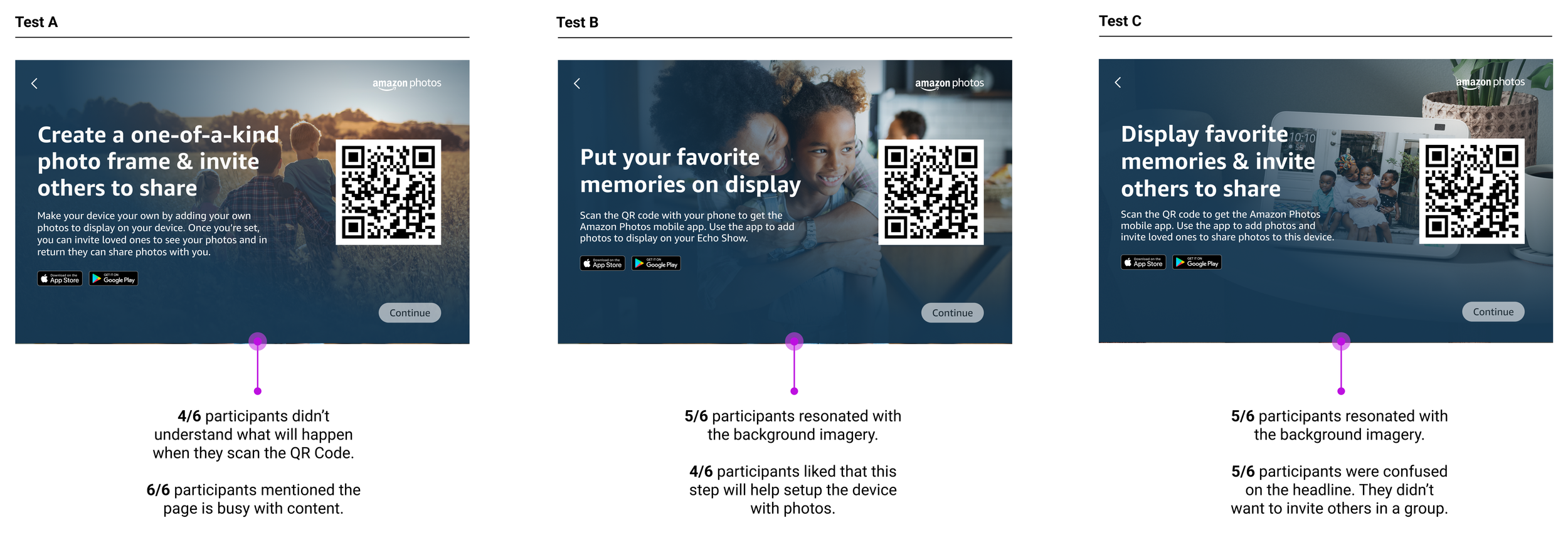
Test different options
Learn from the customer
I quickly planned a usability test with 3 options that I aligned with Product. Customers resonated with a image that involved a device. Some customers mentioned it helped persuade them to display photos.
Most customers were confused about the headline. They want to only display photos, they don’t want to share photos with friends and family.
Multi-Modal Challenge
Design for all devices
With the release, I had to collaborate with our devices team and the Echo Show to align with all devices. This includes legacy Echo Shows with small screens and circular screens.
The releases were phased out in different release dates and I can to manage and coordinate with the engineer teams to launch with high-craft and execution.

Results
Increased Amazon Photos Downloads
When it launched to multiple devices we saw a 30% increase of Amazon Photos mobile app downloads. However, when customers were going through onboarding on the mobile app, customers were not inviting friends to create a group.
Opportunities
Understand deeper why creating a group for customers is a blocker during boarding
Improve content to be “groups” driven
Converge findings with other organizations
Monitor business impact on Echo Show sales
device personalization Analysis
How might we display photos faster?
Amazon Photos mobile app enables customers to link their Amazon devices and quickly show their albums on the device. Currently, customers are able to do this in multiple channels. However, the Amazon Photos app and Alexa App have high engagement.
4% of customers are using the Amazon Photos app to personalize their Amazon Devices
34% of customers are using the Alexa app to personalize their devices

2023 Q1 interaction design
There is a gap between the apps and I want Alexa App customers to adopt the Amazon Photos App and increase usage. I did an analysis and found opportunities to improve the experience.
Increase awareness where this page lives. Currently, customers need to do 3 clicks
Balance priorities on the device personalization page. Currently, it focus on Daily Memories
Improve accessibility on touch targets on collection cards
Explore options to expose collections, rather then going to another page
Iterations
Device Focus vs Collection Focus
For the first quarter I worked along side product and engineer to brainstorm on a refresh on the device personalization page. I wanted to keep some principles in mind during this process:
Focus on what customers want to display
Simplify and design for ease
Have the customers photos as the focal point
Utilize patterns that customers are familiar
For the final option we released a simplified design that gives focus on the customers groups and gives an option for customers to display other collections they have created.

Usability Test Findings
Customer feedback
I tested version 9 of the designs and resulted in some positives and negatives. Product and Engineers were aligned on the design decision and I wanted to quickly test to see hear customers reactions.

Finding #1:
4/6 customers don’t understand the ‘Manage’ button
Customers were confused what the ‘Manage’ did. Was they clicked it, they understood what it did.
Recommendation - we went back to a similar pattern we had on the current designs and introduced a signifier letting customers know that the collection is enabled.
Finding #2:
5/6 customers understood ingress points
Most customers understood they can click on shared photo albums. Some customers wanted to understand how Amazon chooses photos on Daily Memories.
Recommendation - explore content treatments or awareness on how Daily Memories work and how Amazon treats customers photos.


Finding #3:
4/6 customers had concerns on content
Some customers were confused on the labels. They were curious on why it was labeled the way it is and why they were different.
Recommendation - with feedback from the team we decided to relabel each section as ‘Shared collections’ and ‘Personal collections’.

Final DESIGN DECISIONS
The final photo-op
To drive higher adoption of group activity and personalizing devices with shared albums. I had 3 core principles that helped these design decisions:
Give Shared collections space to shine
Give context to customers to relieve stress
Give customers CTA to drive additional personalization on devices

Photo perfect results 📸
The team released the redesign and on the first 60 days the results were in:
3% increase of group activity and enabled groups on devices
2% of customers invited friends and family on the group
Large drop off of customers enabling Daily Memories
Opportunities
Drive higher adoption of enabling Daily Memories
Increase creation of additional Shared Albums from customers
Increase communication notifications for customers that bypassed creating groups during onboarding
Collaborate with Home Page team to increase device personalization as part of the top level information architecture

Stepping up to lead the project
5 months in the lead designer rolled off and I was asked to lead the project.
With this change I had take on the first time user experience roll, presenting to leadership and collaborating with Engineer team to take the work to the finish line.
Delightful onboarding
Starting with data
When I took ownership of mobile onboarding experience I had to take a step back and understand what the previous designer worked on. Prior to the handoff the team launched 10% of the customer based for iOS and got data from customers. This data informed us on next steps for improvement.
Next steps:
Release of Android OS
Provide recommendations with 30 day metrics
Draft an analysis on why we are landing customers on the devices page and not the group page
